A visual and structural redesign focused on improving clarity, navigation, and overall user experience.
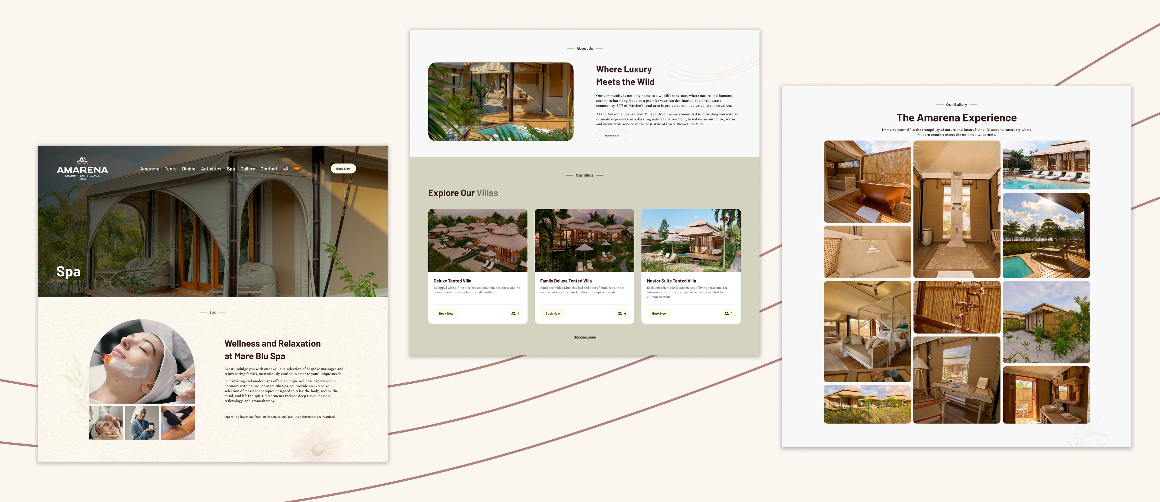
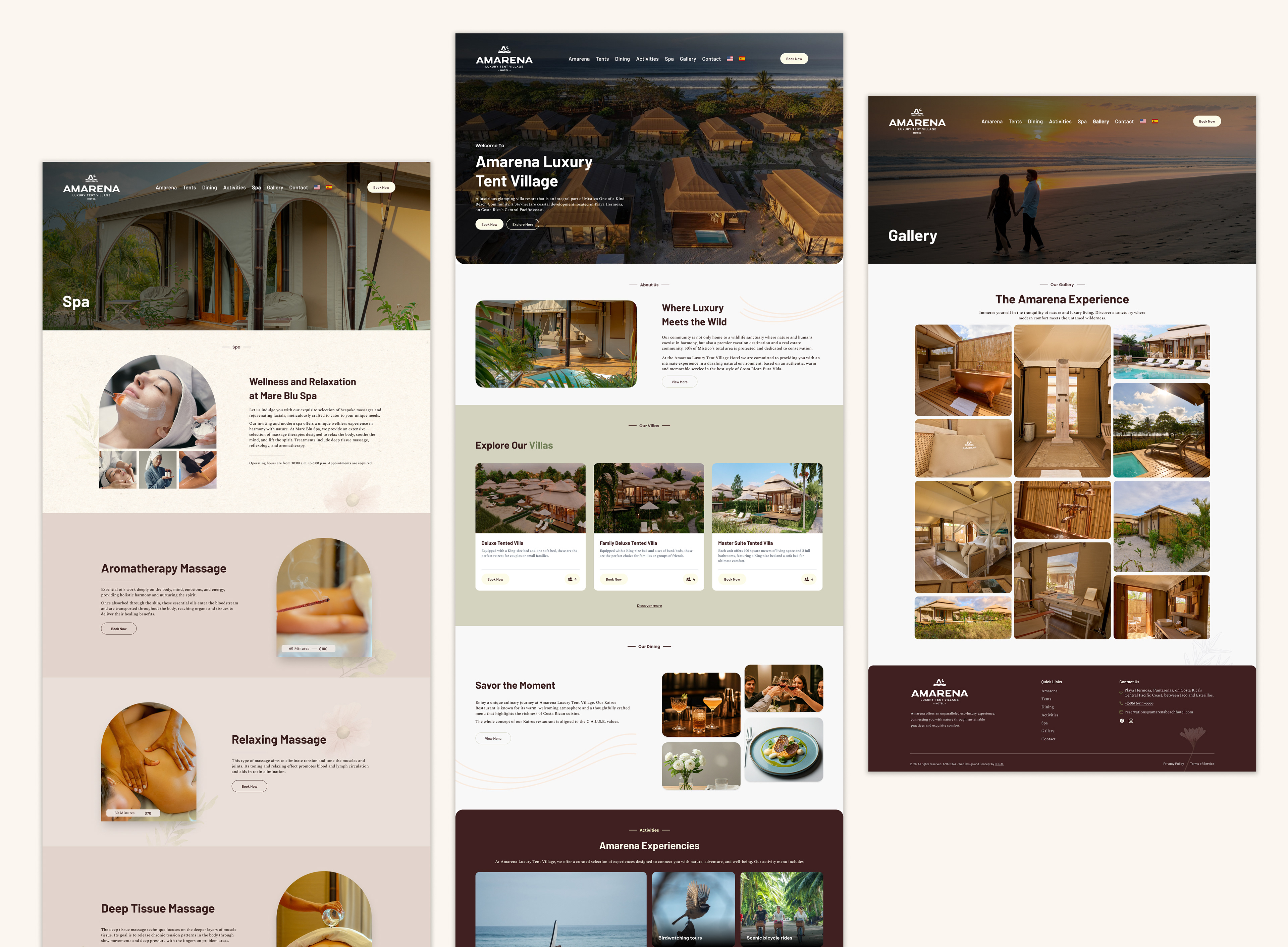
The original landing relied on a long vertical scroll, which diluted content hierarchy and made navigation less intuitive. The new approach restructures the experience into separated interfaces, allowing each section to stand on its own and improving content discoverability.
Approach
The goal was to create a more editorial and immersive experience, aligned with the brand’s aesthetic while enhancing usability.
We focused on:
· Simplifying navigation and reducing cognitive load
· Strengthening visual hierarchy
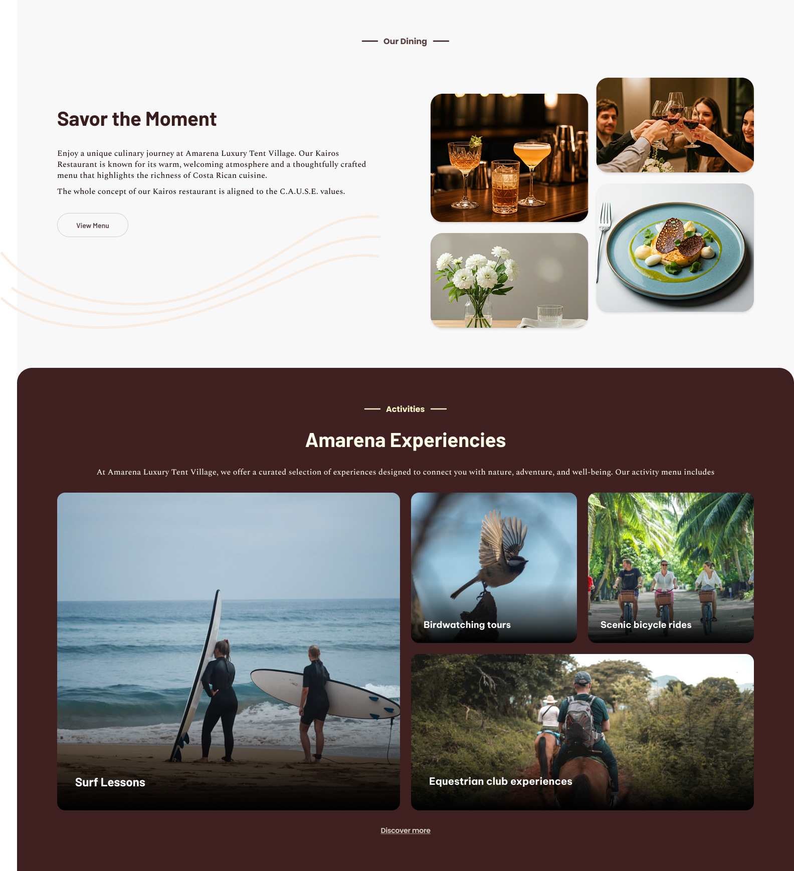
· Letting high-quality imagery lead the experience
· Refining content and microcopy
Key Improvements
Navigation & Structure
· Transition from a single long-scroll landing to modular, section-based navigation, improving clarity and flow.
· Transition from a single long-scroll landing to modular, section-based navigation, improving clarity and flow.
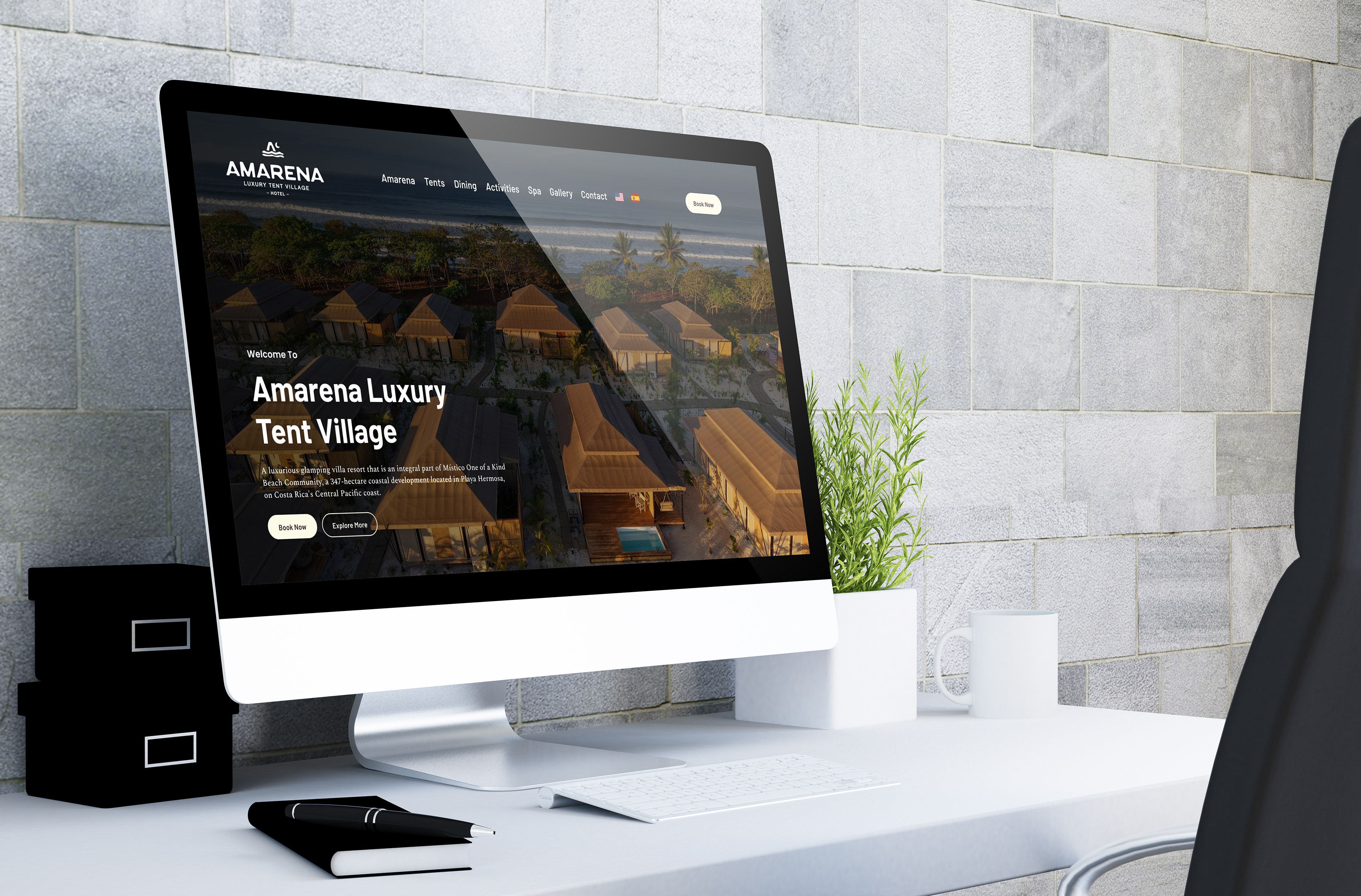
Visual System
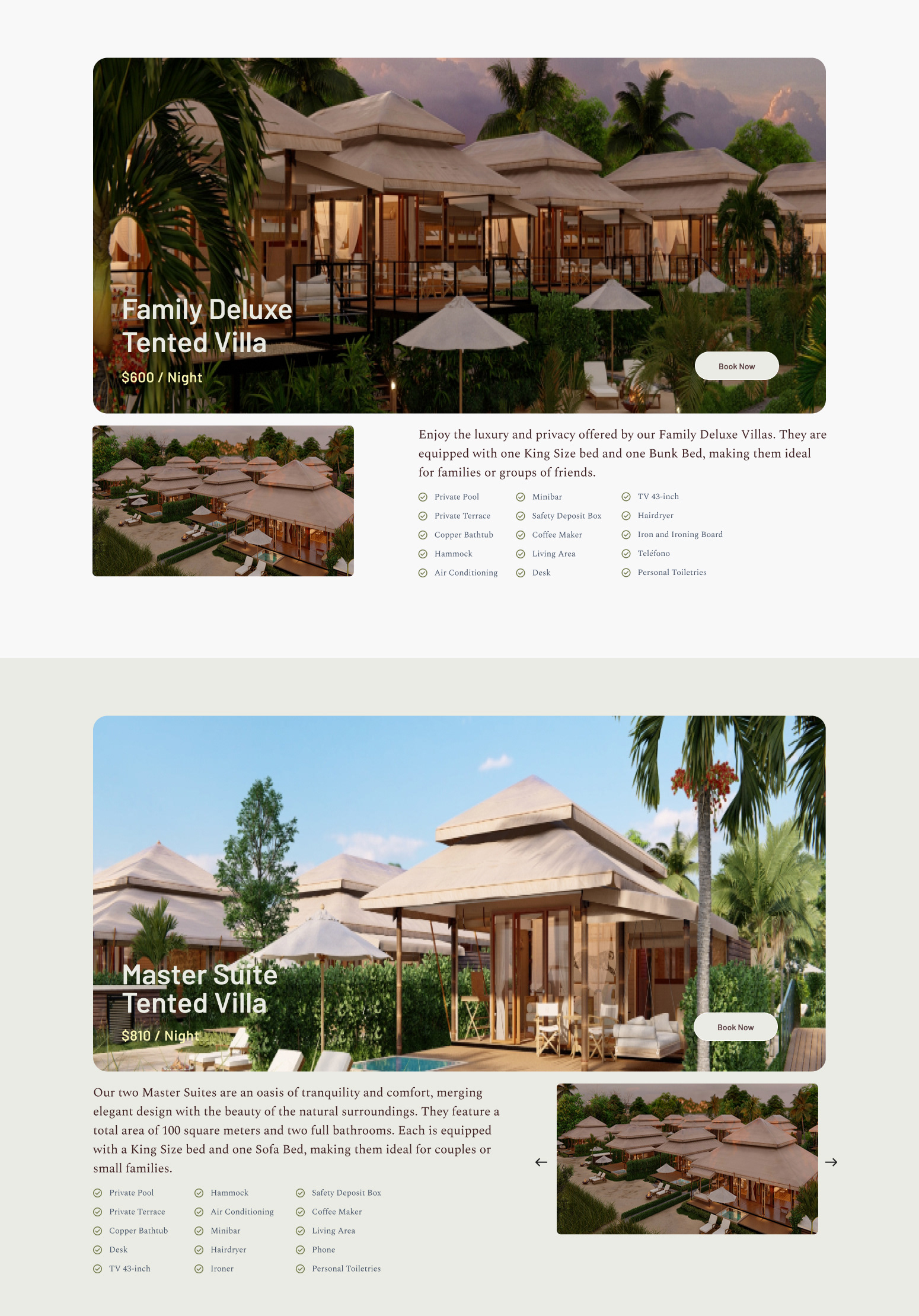
· Full-width imagery for stronger visual impact
· Optimized spacing and layout across all screens
· Consistent header and section compositions
Content & Microcopy
· Refined section naming for better clarity (e.g. Amarena Experiences, Spa Menu)
· Cleaner, more concise messaging
· Improved readability across components
Components
· Redesigned cards with clearer information hierarchy
· Key details (like guest capacity) moved imagery for better legibility
Assets & Quality
· Replaced low-resolution images with high-quality visuals
· Updated imagery across key sections (Spa, Villas, Headers)
OUTCOMES
A cleaner, more structured experience that:
· Improves navigation and content discovery
· Elevates the brand perception
· Creates a more immersive and premium feel